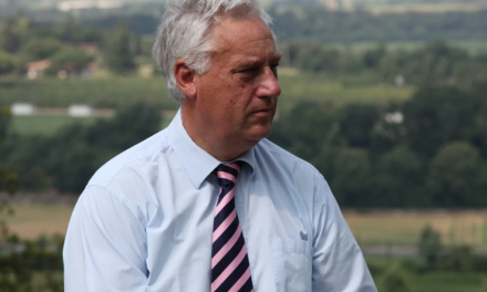
5 Questions for Arne Kvorning
Originally published on July 11, 2014Some, if not many, consider you something else other than what is traditionally thought of as an architect. Is that true? Could you perhaps be described as an architect of physical experiences?
I actually think that ‘architect of physical experiences’ should be the title printed on my next set of business cards. It is, in fact, a very precise description of what we are actually doing at my studio.
My professional background is as an architect. However, already back then at the school of architecture, I worked with scenography for television and experience design – it was simply called visual communication then – and eventually production design. So my mindset is definitely that of the experience designer, and arguably that of the production designer too – but it is still also very much the mindset of the architect with a more level-headed and technical approach, which is a huge benefit as most things need to be produced and constructed as well. Among the strengths and trademarks of our studio are definitely the ability to combine architectural design and dramaturgical staging. Furthermore, within our team we have a wide combination of competencies that are needed to conceptualize, design, produce and build exhibitions and experiences of the size and complexity, we are working with.
What do you see as the significant differences between designing exhibitions and fine art displays?
In fact, that is one question I am presented with again and again, and I think it is a very hard one to answer, as I really do not see the big difference between the two. They are both about conveying and staging the content of the experience. In my point of view, any task involving the presentation of information is composed of interpretation, design and dramaturgy – three ingredients that ultimately should merge together in a relevant and relatable way. The story directs the design and the staging, regardless if it is a themed exhibition or an art exhibition. Throughout the years we have predominantly worked with themed exhibitions in all shapes and sizes with topics in all categories … As we often say, we work with everything from ‘world exhibitions to business cards’.
We have also worked with art exhibitions, and we do get an increasing number of inquiries from that kind of museums and institutions. Recently, I have been invited to design and curate an exhibition at The State Museum of the City Sculpture in St. Petersburg late 2014, which will definitely be a cross-over of art and architecture. I am obviously looking very much forward to that. From its initialization, this project is applying and combining dramaturgy and scenography, and it will be a staging that will involve thousands of postcards depicting the city’s monuments in an installation art setting in the exhibition room. Postcards tell the story of the developmental stages of a city … This fits right in the middle of art and architecture.

What are the unique considerations when dealing with aquatic type subject matter, or any context that is not normally an easily acquired experience for the audience?
As with most exhibitions, the challenge is not to let the design overshadow the narrative – the role of the design is to enhance the storyline and make it even better. In aquaria experiencing the living fish is the most important thing. It takes the collaborative effort of the architect, the exhibition designer and the professional team working at the aquarium. It is a form of communication of information and insight that has to create a mix of professional knowledge with the unique experience of being part of life under the sea and swim with the fish.
My position on presenting knowledge in aquaria is clearly that the communication and the interactive elements, signage and so on have to be integrated as naturally and simply as possible. That way, they become elements the audience can choose to go deeper into while maintaining a fine balance with the meditative experience it is to watch a school of fish or a beautiful shark in their natural element.
How do you evaluate The Blue Planet as an overall audience experience? The architectonic aspect has had a high appraisal in the media, while the experience itself and the mediation of knowledge has had some criticism. What are your thoughts on this, do you find any lessons learned in particular?
In its first year alone, The Blue Planet has had more than 1,4 million visitors of all ages. It is the largest audience success ever in the Danish history of experience design … One has to remember that. There have been some critical voices, but there has also been an infinite amount of positive publicity of both the architecture, the presentation of knowledge and the experience design. The vast number of visitors – which is an important criterion for success – has also had a negative side, though.
Having many, many visitors at the same time results in firstly a long cue line forming at the entrance. That builds expectation, but at the same time is a very big and pronounced source of irritation among the visitors – which is an understandable and obvious reaction. Following standing in the cue line, the audience flow within the building is really put to the test as hundreds of visitors are admitted at once. This presents significant problems when people want to pass by each other to get the best view of the aquaria and access to the presentation of knowledge and interactive installations. The Blue Planet has received some criticism for this. So – bottom line – The Blue Planet has so to say drowned in its own success.
The presentation of information itself has been developed by the aquarium’s highly skilled professional team, and that has been a very positive experience with a superb collaboration between everyone involved. The Blue Planet changed its management structure in the middle of the development of the project, which did make some of the processes regarding content more difficult. The stories and the angle and extent of information have also had some criticism after the opening – but that part really has to be seen as the aquaria’s own making and decision. Fortunately, the content can be updated and changed in a relatively simple way – the design takes this into account – so now it is being adapted to demands and wished from the new management.
The extremely high number of visitors – by Danish standards, anyway – has led to an equally rapid wear of the exhibitions and the installations. Initially, The Blue Planet had an optimistic estimation of about 700.000 visitors the first year, which turned into 1,4 million visitors … The combination of this and the fact that the aquarium, unfortunately, did not prepare to maintain the exhibitions at an adequate level, means that the wear shows – which unfortunately leads to some criticism. This situation also unavoidably reflects back on the exhibition designer, and that is why it is important to tell the whole story and share the full background leading up to and after the opening of the aquarium.
Our most important experience from the course of events regarding The Blue Planet has to be that an experience designer never should take on the task of installing an advanced an interactive exhibition if the client has not signed a comprehensive service agreement upfront – or has made certain they have built up the necessary internal organization to support the experience, they have invested in. In the future, we will want far more insight into these very important considerations, that every museum, aquarium or other places of exhibition must think of, for their project to become a success for everybody involved.
What are you working on right now?
We have just completed a large, expressive exhibition at Norwegian Road Museum in Lillehammer in Norway. It is a permanent, 1000 m2 exhibition about Norwegian road construction spanning 150 years.
Three weeks ago we won the competition for the storyline development at Carlsberg’s upcoming experience centre – Carlsberg Brewhouse Experience. We will work on the guidelines for presenting the design, architecture and history of the buildings, as well as the ingredients and the process related to the beer brewing. These two are very important narratives, which have to live side by side with the many experiences that will also be part of Carlsberg Brewhouse Experience. We cannot share any idea and designs specifics yet, though.
We are also about to start work on the exhibition in St. Petersburg I mentioned earlier. Furthermore, on our to-do list, we have continuous projects for a number of our regular clients – LEGO Systems, AP Moeller Maersk, Danfoss, Norwegian Defense Museum and others – not to mention project competitions around the world.
For now, though, the summer vacation is coming up. So we take a much-needed break after an unusually busy and eventful year.
For more about Kvorning Design and Communication, please visit
http://www.kvorning.dk/#/home/
For Norwegian Road Museum exhibition photos and information, please visit
http://www.kvorning.dk/#/browseuk/the_norwegian_road_museum
For more about The Blue Planet, please visit
http://www.denblaaplanet.dk/en/
The words in this article were translated from Danish by The Experience Economist.


